
It is important for users to understand figma button component. Buttons work as central interactive elements that let users conduct actions and submit forms along with moving between different digital interfaces. The basic elements of user interface design require figma button components to establish both user-friendliness and visual appeal. Through this feature designers maintain the ability to adjust button compatibility styles also control their actions and correspondence features for specific project needs. The following guide presents an in-depth look at button components beginning with their design principles then proceeding to Figma creation guidelines and finishing with real-world examples that boost user interactions. See more blog
Understanding Figma Button Component:
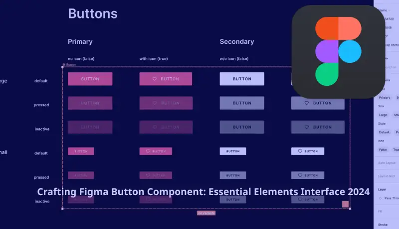
Users of Figma can activate actions through button components which function as clickable interface elements. The design features visual elements with text or icons which might incorporate color specifications and dimensions along with shapes. The design range for Figma buttons extends from primary action buttons which perform important functions to secondary and tertiary buttons which serve lesser important actions.
Table of Contents
1) Importance of Button Components:
User interfaces depend on Figma Button components for multiple important reasons that include:
a) Clear Call to Action:
Through buttons a user obtains distinct signals about interface interactions which direct them through steps such as form submissions or decision confirmation and content exploration.
b) Enhanced Usability:
Thoughtfully created buttons serve as effectiveness-enhancing components because they guide users to navigate their way through interfaces with high efficiency. User experience remains smooth when buttons exhibit standard forms and operate similarly to one another.
c) Visual Hierarchy:
The Figma Button Components system establishes interface visual hierarchy because they enable creators to separate main functionality buttons from lesser important components. Through varied button design elements which include style variations and size adjustments along with color selection designers guide users to essential actions while reducing mental strain.
d) Brand Identity:
The interface brand identity along with its aesthetic characteristics develop through button styles together with visual components. Design consistency regarding buttons that spans across various user interfaces strengthens brand recognition and maintains interface consistency. The Figma application includes a Button Component that functions as an important design element.
2) What is Button Component in Figma?
The Figma platform supplies Figma Button Component which serve as interchangeable design elements that easily transform according to different state requirements and usage conditions. Design components serve as essential tools which maintain uniform design elements and boost team efficiency.
3) Why Use Figma Button Components?
- The uniform appearance happens because button components provide consistent design throughout the entire project.
- The tool supports global scalability because it enables instant bulk updates across the system.
- The system enhances efficiency through automated use of previously designed reusable elements.
- The shared design system benefits from collaborative features which facilitate team member design system maintenance.
- The feature enables designers to make adaptable interfaces that function properly on different screen sizes.
4) How to Create a Button Component in Figma
1. Frame Your Button
- Begin the process by drawing a Frame object (F) designated as ‘Button.’
- Establish a dimension of 120×40 pixels while adding circular edges to achieve contemporary results.
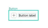
2. Add Text
- You can generate text labels easily using the Text (T) application tool and specify ‘Click Me.’ as the label text.
- Center-align the text within the frame for proper positioning.
3. Style Your Button
- The component needs a selected background color together with padding attributes and border radius modifications.
- Select your text element before changing font type along with size and color to conform to branding requirements.
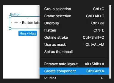
4. Create Variants
- Choose the button object and initiate the ‘Create Component’ command by using the shortcut key combination ‘Ctrl/Cmd + Alt + K’.
- Multiple button states should be defined using the Variants tool into Default, Hover, Active and Disabled categories.
- Use distinct variants naming for smooth recognition.
5. Add Interactions (Optional)
- Widen your project understanding through linkages and hover/click simulation in Figma’s Prototype tab.
- Implement trigger actions to enhance interactive design operations.
6. Publish to Libraries
- When you finalize the button component it should be published to your design library for repeated use.
- Provide the design to your team members for maintaining uniformity throughout all projects.
5) Best Practices for Figma Button Components
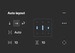
Utilize Auto Layout
The button will automatically resize through Auto Layout according to the changes in text length. The button element becomes adjustable based on the length of the text labels through this feature.
Add Icons
Buttons should include visual icons as integration elements to create enhanced user interface components. To show actions in the design you can append arrows or checkmarks to buttons.
Test Different States
Check how each button state looks during default mode and during hover mode and during active mode and prevent any mode from becoming disabled while making sure all these states remain visible. The improved access and user interaction results from this modification approach.
Follow Accessibility Guidelines
The button text should have enough distinction against its surrounding background. You should provide screen reader users with both tooltips and ARIA labels.
Organize Components Clearly
Logical variant organization will enable designers to select appropriate states easlily.
Version Control
A system for monitoring component update history helps prevent inconsistent visual experiences.
Advanced Tips for Button Components
- The creation of nested components that include buttons together with icons or dropdowns renders these elements more adaptable for use.
- Inside Auto Layout you can apply padding settings which enable your buttons to adjust automatically when content changes.
- Users need to conduct prototype interaction testing in Figma designs for obtaining early feedback about their work.
- All fundamental design elements need to be stored within design tokens because this approach promotes visual consistency across various projects.
6) Common Use Cases for Button Components
Call-to-Action (CTA)
User actions can be directed through primary action buttons because of their defined functionality which includes “Buy Now” and “Sign Up” buttons.
Secondary Buttons
The interface includes buttons for “Learn More” and “Cancel” as supporting functions.
Toggles and Switches
Buttons for on/off states.
Icon Buttons
Compact buttons with icons only, ideal for toolbars and menus.
Forms and Modals
Users can operate forms and dialogs through form-submitting and dialog-closing buttons.
7) Troubleshooting Button Components in Figma
Buttons Don’t Resize Properly
Auto Layout functionality must be enabled before adjusting the padding parameters.
Hover State Not Working
Check the prototype configuration along with trigger associations to fix the issue.
Variants Not Displaying
Verify that all component sets contain the same grouping of variants.
Text Overflows
The button requires Auto Layout to become responsive.
Finally:
The Figma Button Component works as an essential component for user interfaces because it gives users important signals to understand their digital interaction possibilities. Applying best design practices for figma button components and their adjustable features enables designers to boost user satisfaction and brand consistency. The well-placed button component functions as users’ main interface tool by providing directions for form completion and content navigation while enabling action triggers. Figma allows designers to create engaging button components through its user-friendly interface combined with powerful design tools which result in improved digital platform user engagement.

